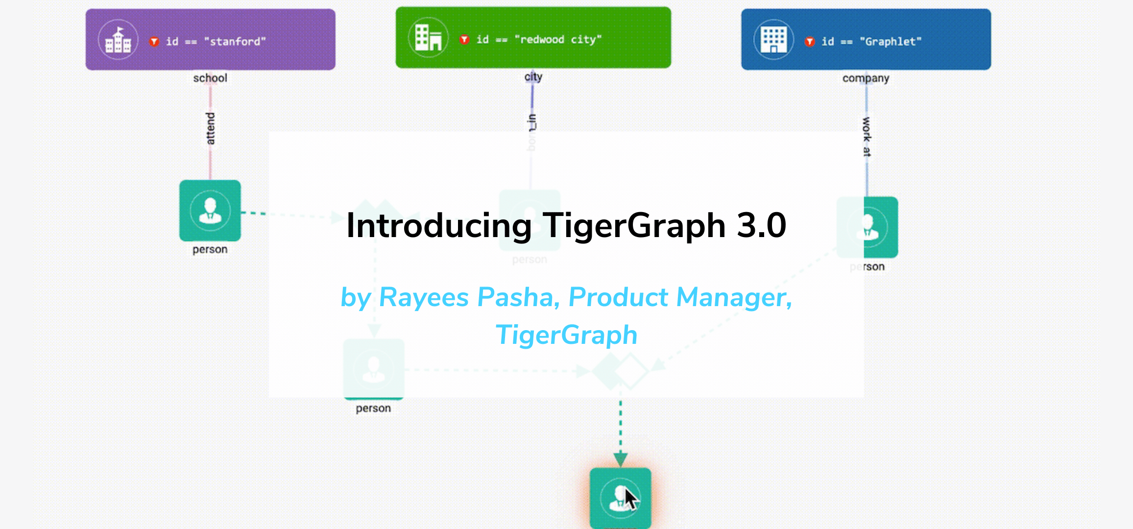


Creating a full web-app using Plotly Dash and TigerGraph
Introduction
In this blog, you’ll see some of the steps necessary to create a full fraud-detection web app connected to a backend graph database. We won’t cover all of the components, but rather give a brief overview of some of the key parts.
All-in-all, the full dashboard ends up looking like this.
Note: You can find the full code here.
Agenda
- Motivation
- Technologies
- Dashboard Setup
- Dashboard Components
- Conclusion
Motivation
The importance of data visualization cannot be understated. Visualizations are what allow developers to present “meaningless” data in a way that’s efficient, effective, and impactful. It’s integral in understanding data and making decisions, and it has applications in every field. This, of course, includes the business and finance world.
As important as data is, businesses can’t properly evaluate the data unless it’s in an easy-to-digest format. For areas like fraud detection, where properly understanding data is key to stopping malicious acts and saving billions of dollars, visualizations are extremely important.
Technologies
To create this fraud detection dashboard, we are using two main technologies.
Dash
Dash is a Python package specifically made for designing analytical dashboards for data science. The library offers an enormous amount of ready-to-use components, including every common HTML component. It also comes with widgets such as sliders, text boxes, and navigation bars, all of which are extremely easy to use. Dash abstracts away the complicated HTML, CSS and JS and allows you to add components with jsut a few lines of code. But, they also offer the option to add custom styling or custom components, giving users true freedom in creating their dashboard.
TigerGraph
TigerGraph is one of the fastest graph database platform in the world. Using their streamlined platform, you can create graphs with billions of nodes and edges that operate in realtime. TigerGraph also makes use of GSQL, their own graph query language that mimics SQL syntax and allows for quick and easy querying of graph data.
If you haven’t already done so, check out Getting Started with TigerGraph Starter Kits. That blog goes through many of the features of the fraud detection graph database that is being used for this dashboard.
With that, let’s dive into creating this dashboard!
Dashboard Setup
Packages and Imports
There are a few packages needed for this project.
# pip install jupyter-dash -- for Jupyter notebook environments
pip install -q dash
pip install -q pyTigerGraph
pip install -q dash-bootstrap-components
pip install -q dash_daq
pip install dash-extensions
From these packages, we can import everything we need.
import plotly.express as px
# from jupyter_dash import JupyterDash
from dash import Dash
import dash_core_components as dcc
import dash_html_components as html
from dash.dependencies import Input, Output, State
import plotly.graph_objects as go
import pandas as pd
import dash_bootstrap_components as dbc
import datetime
from dash.exceptions import PreventUpdate
import dash_table
import json
from dash.dash import no_update
import dash_daq as daq
from dash_extensions import Download
from dash_extensions.snippets import send_data_frameimport pyTigerGraph as tg
Setting up pyTigerGraph
pyTigerGraph is Python package that manages connecting to your TigerGraph server and working with the built-in REST endpoints from TigerGraph. To set up the connector, we just need a few lines of code.
configs = {
    "host": "https://YOUR_URL",
    "password": "YOUR_PASSWORD",
    "graphname": "YOUR_GRAPHNAME"
}

conn = tg.TigerGraphConnection(host=configs['host'], password=configs['password'], gsqlVersion="3.0.5", useCert=True, graphname=configs['graphname'])
conn.apiToken = conn.getToken(conn.createSecret())
App Structure
The basic structure of the Dash app is as follows:
# app = JupyterDash(__name__, external_stylesheets=[])app = Dash(__name__, external_stylesheets=[LIST_OF_SHEET_URLS])
app.layout = html.Div(
                 YOUR_COMPONENTS
             )ALL_APP_CALLBACKSif __name__ == '__main__':
    app.run_server()
Each of the components described below has to be placed in the app.layout body, while all of the callbacks have to be placed below or in a separate file.
Dashboard Components
There are lots of different components that go into making this dashboard. In the full version, this dashboard has complex callback functions for user interaction, multiple pages for displaying different content, and live communication between the dashboard and the backend TigerGraph server.
There’s a lot to get through, so let’s just go through each piece one-at-a-time.
Note: The emphasis of these descriptions will be on the app components rather than the styling. The layout and CSS style for all components will be included, but should not be taken as the only way to style a dashboard.
Navbar
The navigation bar sits at the top of the page and is used to display basic information as well as other handy widgets (in our case, a search bar).
To make the navigation bar, you can use Dash Bootstrap Components, a standalone Python package of Dash components modeled after the Bootstrap library.
On the documentation page, you can find examples for creating all of the components available, including a navigation bar.
Using this page as a start, we slightly modified the code to make the component more unique.
Here’s what the code looks like.
TG_LOGO = "https://media.glassdoor.com/sqll/1145722/tigergraph-squarelogo-1544825603428.png"

search_bar = dbc.Row(
    [
        dbc.Col(dbc.Input(type="search", placeholder="Search", id="search_bar")),
        dbc.Col(
            dbc.Button("Search", color="primary", className="ml-2", id="search_bar_button"),
            width="auto",
        ),
    ],
    style={"margin-right": "3rem"},
    no_gutters=True,
    className="ml-auto flex-nowrap mt-3 mt-md-0",
    align="center",
)

navbar = dbc.Navbar(
    [
        html.A(
            # Use row and col to control vertical alignment of logo / brand
            dbc.Row(
                [
                    dbc.Col(html.Img(src=TG_LOGO, height="30px")),
                    dbc.Col(dbc.NavbarBrand("Anti Fraud", className="ml-2")),
                ], style={"margin-left": "11%"},
                align="center",
                no_gutters=True,
            ),
            href="https://tigerGraph.com",
        ),
        dbc.NavbarToggler(id="navbar-toggler"),
        dbc.Collapse(search_bar, id="navbar-collapse", navbar=True),
    ],
    color="dark",
    dark=True,
    sticky="top",
    style={'width': 'calc(100% - 12rem)', 'float': 'right', 'height': '4.5rem'}
)
We start by creating a search bar, which contains a input field and a button. We then add this search bar to the nav bar along with a clickable image and title.
The code above produces a nav bar that looks like this.

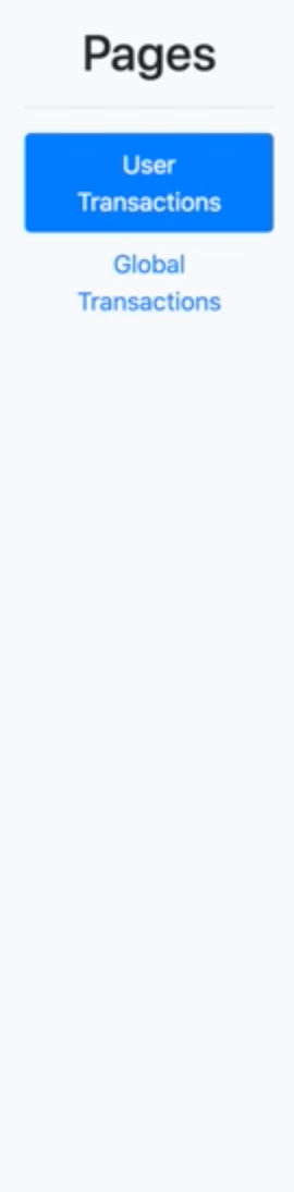
Sidebar
Once you have the nav bar done, the sidebar is very straightforward. The sidebar isn’t a component included in the Dash Bootstrap components, but there is an example on their site that shows how to make one.
Essentially, it is just a navigation bar that has been flipped sideways. Again, we modify the code slightly to fit our specifications.
SIDEBAR_STYLE = {
    "position": "fixed",
    "top": 0,
    "left": 0,
    "bottom": 0,
    "width": "12rem",
    "padding": "1rem 1rem",
    "background-color": "#f8f9fa",
    'text-align': 'center'
}

links = {
    "User Transactions": ["/user-transactions", "user-transactions-link"],
    "Global Transactions": ["/global-transactions", "global-transactions-link"]
}

sidebar = html.Div(
    [
        html.H2("Pages", className="display-6"),
        html.Hr(),
        dbc.Nav(
            [dbc.NavLink(x, href=links[x][0], id=links[x][1]) for x in links.keys()],
            vertical=True,
            pills=True,
        ),
    ],
    style=SIDEBAR_STYLE,
)
We use a nav for the different tabs on the side bar and basic components for the rest.
Notice the two links we included. These links will be used for page navigation once we implement the multipage functionality to our app.
The code creates the following sidebar:
Multipage Functionality
To allow our web-app to have multiple different pages, we need to use the dcc.Location component. This allows us to control the path after the domain name. For each page we want, we simply create a unique path and load that page when that path is called.
So, what does this look like?
For the layout, all we need to do is add the dcc.Location component and an html.Div component to store the page content.
dcc.Location(id="url", refresh=False),
html.Div(id='page-content')
Now, we need to add two callback functions. We use the same links as used in the sidebar earlier
# Declare information for pages
links = {
    "User Transactions": ["/user-transactions", "user-transactions-link"],
    "Global Transactions": ["/global-transactions", "global-transactions-link"]
}

# Switch pathname for url
@app.callback(
    [Output(f"{links[id][1]}", "active") for id in links.keys()],
    [Input("url", "pathname")],
)
def toggle_active_links(pathname):
    if pathname == "/" or pathname == "//":
        # Treat page 1 as the homepage / index
        return True, False
    return [pathname == f"{links[id][0]}" for id in links.keys()]

# Set page for each pathname
@app.callback(
    Output("page-content", "children"),
    [Input("url", "pathname")]
)
def render_page_content(pathname):
    if pathname in ["/", "//", f"{links[list(links.keys())[0]][0]}"]:
        return user_page
    else:
        return transaction_page
    return dbc.Jumbotron(
        [
            html.H1("404: Not found", className="text-danger"),
            html.Hr(),
            html.P(f"The pathname {pathname} was not recognised..."),
        ]
    )
The first function toggles the pathname after the domain name in the url, and the second sets the page content for each page.
Note: The second callback returns “user_page” and “transaction_page” as the corresponding pages for each pathname. These will be defined in the next two component sections.
User page
The user page consists of different information about a particular user.
Structure
The page has 5 components. There are 2 dials for displaying the user’s risk scores, a bullet chart showing aggregate stats, and a bar chart and table displaying all of the user transactions.
Here’s how the page layout looks.
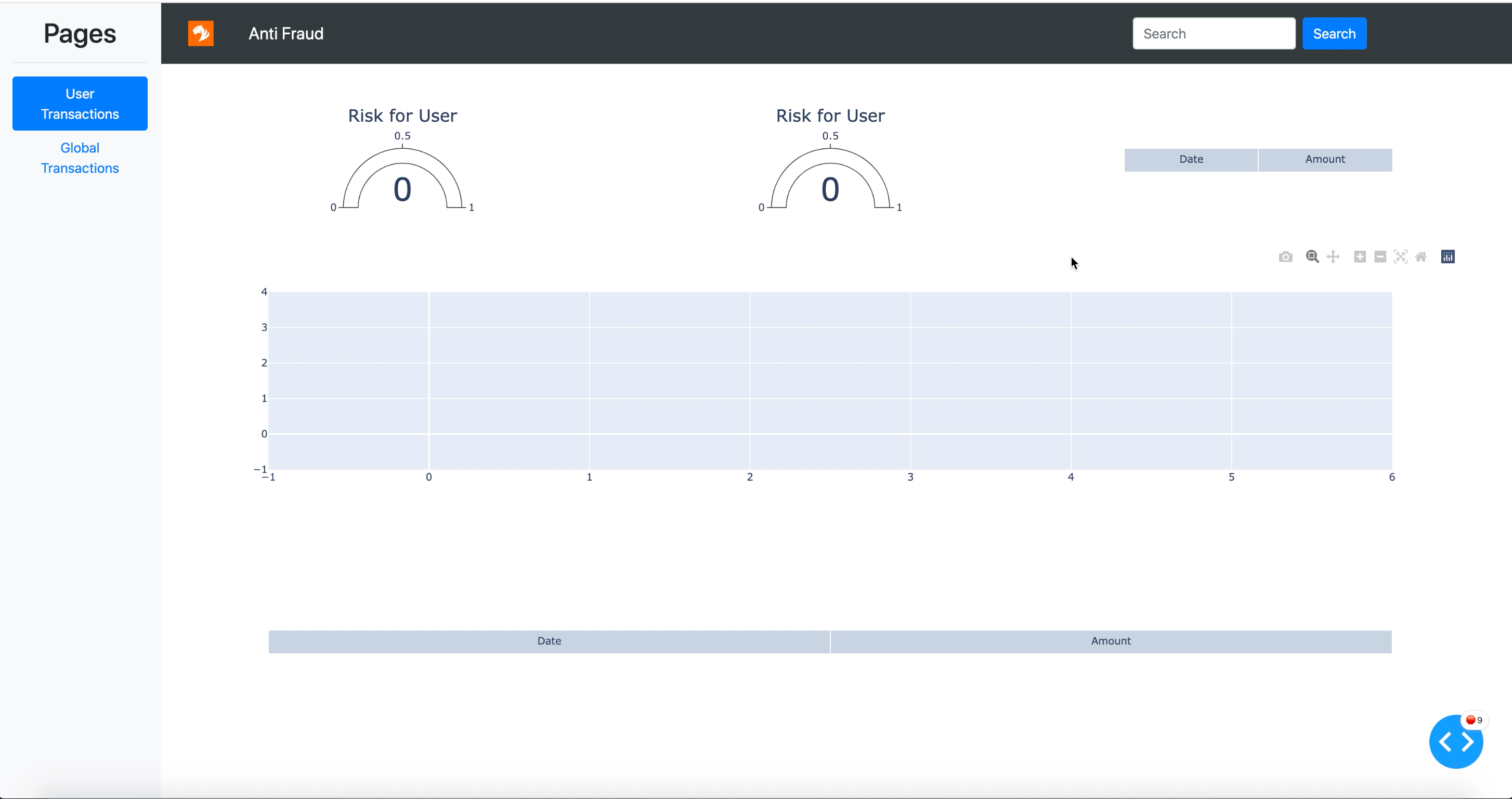
Here’s what the base code looks like. It is simply a collection of divs, rows, and columns.
# Layout for user info page
user_page = dcc.Loading(
    children=html.Div([
        dbc.Row([
            dbc.Col(html.Div(
                dcc.Graph(id='risk_dial_user', figure=initial_dial),
                style={"background-color": "#424242", 'width': '100%', 'height': '100%'},
            ),
            width=4,
            ),
        dbc.Col(html.Div(
                dcc.Graph(id='risk_dial_card', figure=initial_dial),
                style={"background-color": "#424242", 'width': '100%', 'height': '100%'},
            ),
            width=4,
            ),
        dbc.Col(html.Div(
                dcc.Graph(id='bullet_chart_data', figure=initial_table),
                style={"background-color": "#424242", 'width': '100%', 'height': '100%'},
            ),
            width=4,
            ),
        ], style={"height": "200px", "width": "100%", "margin-left": "auto", "margin-right": "auto", "margin-bottom": "10px", "margin-top": "10px"}),
        dbc.Row(dbc.Col(html.Div(
                    dcc.Graph(id='bar_chart', figure=px.bar(height=350, labels={'x': "Date", "y": "Amount"})),
                    style={"background-color": "#424242", 'width': '100%', 'height': '100%', "vertical-align": "center"}
                ),
                width=12,
                ),
                style={"height": "350px", "width": "100%", "margin-left": "auto", "margin-right": "auto", "margin-bottom": "10px"}
        ),
        dbc.Row(dbc.Col(html.Div(
                    dcc.Graph(id='table_chart', figure=initial_table),
                    style={"background-color": "#424242", 'width': '100%', 'height': '100%'},
                ),
                width=12,
                ),
                style={"height": "250px", "width": "100%", "margin-left": "auto", "margin-right": "auto"}
        )
    ]), type='default', id='user_loading'
)
Note: There are no charts in the default page. This is because all of the charts are created dynamically. This allows the page to be updated when a new user ID is entered.
Sample Chart
To show an example of making the user information charts, let’s look at one of the basic user risk score dials.
First, we need to create a custom GSQL query in TigerGraph.
CREATE QUERY PaymentRisk(Vertex Source) FOR GRAPH AntiFraud {
  /*
    Takes in a userID and returns average risk score for the user's credit cards
    Sample input: 333
  */

  AvgAccum @@avgRisk;
  start = {Source};

  card_risk = SELECT tgt
                FROM start:s -(User_to_Payment) -:tgt
                ACCUM @@avgRisk += tgt.trust_score;

  PRINT @@avgRisk AS avgRisk;
}
This query simply takes in a user ID (i.e. “333”) and returns the average risk score of the user’s credit cards. Here’s the output from this query in JSON format.
[
  {
    "avgRisk": 0.5154
  }
]
To make the chart, we use pyTigerGraph to run the query and Plotly to make the gauge.
def getRiskChart(userID):
    card_risk_score = conn.runInstalledQuery("PaymentRisk", params={"Source": userID})[0]['avgRisk']

    card_dial = go.Figure(go.Indicator(
        mode='gauge+number',
        value=card_risk_score,
        title = {'text': f"Avg Card Trust Score for User {userID}"},
        domain = {'x': [0, 1], 'y': [0, 1]},
        gauge = {
            'axis': {'range': [None, 1]},
            'bar': {'color': 'rgba(0,0,0,0)'},
             'steps': [
                {'range': [0, 0.3], 'color': 'red'},
                {'range': [0.3, 0.7], 'color': 'orange'},
                {'range': [0.7, 1.0], 'color': 'green'},
                ],
            'threshold': {
                'line': {'color': "black", 'width': 4},
                'thickness': 0.75,
                'value': card_risk_score}
        }
    ), layout={"height":275})

    return card_dial
Most of the code is cosmetic, except for the threshold value which we set to the output of the GSQL query.
The code above produces a dial that looks like this:

Sample Callback
Now, let’s see how we could integrate this chart into a callback.
@app.callback(
    Output(component_id='risk_dial_card', component_property='figure'),
    [Input(component_id='search_bar_button', component_property='n_clicks')],
    [State(component_id='search_bar', component_property='value')]
)
def updateUser(n_clicks, user_id):
    if n_clicks > 0:
        return getRiskChart(user_id)

    return getRiskChart("333")
The callback takes the value typed into the search bar and creates the risk dial for the entered user ID. There is also a default value that gets triggered when the app is initially loaded.
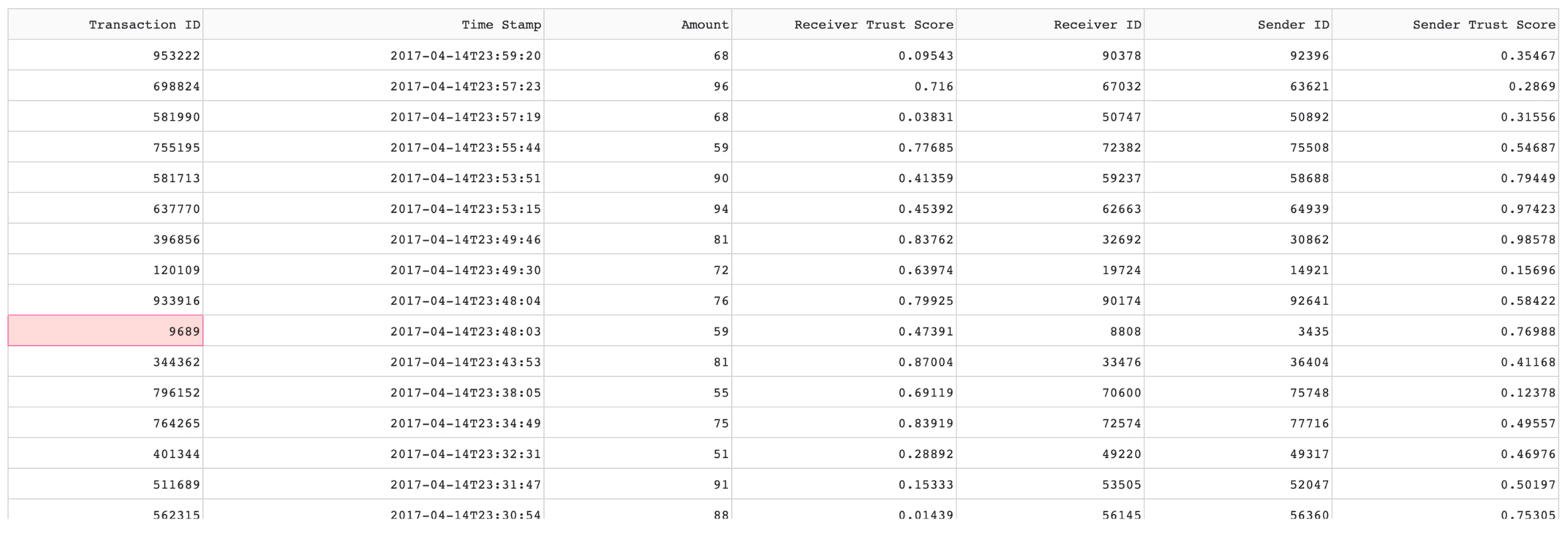
Transaction Page
For our last section, we will cover the transaction page. This page presents a global view of a large collection of transactions in the database.
Structure
The transactions are presented in a table using the DataTable component. The Dash DataTable offers a lot of customization and flexibility which we won’t get into in this blog. But, if you’re interested, check out this post that covers some cool aspects of the table component.
We start by creating a blank table.
columns = ['Transaction ID', 'Time Stamp', 'Amount', 'Receiver Trust Score', 'Receiver ID', 'Sender ID', 'Sender Trust Score']

dash_table.DataTable(
    id='transaction_table',
    fixed_rows={'headers': True, 'data': 0},
    style_table={'height': '500px'},
    style_cell={'whiteSpace': 'normal'},
    virtualization=True,
    page_action='none',
    css=[{'selector': '.row', 'rule': 'margin: 0'}],
    columns= [{"name": i, "id": i} for i in columns],
    style_data_conditional=[{'if': {'column_id': f'{i}'}, 'width': '50px'} for i in columns]
)
Most of the settings shown are for table styling, and the documentation does a great job of explaining all of it.
The corresponding table looks like this:


Note: The virtualization setting makes it so rows beyond the height of the table are hidden, which helps with managing resources for large datasets.
Structure
The general structure of the Transaction Page is as shown:
columns = ['Transaction ID', 'Time Stamp', 'Amount', 'Receiver Trust Score', 'Receiver ID', 'Sender ID', 'Sender Trust Score']

# Create page for global transaction information
transaction_page = html.Div([
    dbc.Row(
        [
            dbc.Col(html.H1('Transaction Analysis'), width=4),
            dbc.Col(daq.BooleanSwitch(id='live_switch', on=False, label="Live", labelPosition="bottom"), width=1)
        ],
        justify='between'
    ),
    dbc.Row(
        [
            dbc.Col(
                dcc.DatePickerRange(
                    id='date-picker-range',
                    min_date_allowed=datetime.date(1970, 1, 1),
                    max_date_allowed=datetime.date(2020, 10, 5),
                    initial_visible_month=datetime.date(2017, 5, 31),
                    end_date=datetime.date(2017, 5, 31),
                    style={'position':'relative', 'zIndex':'999'}
                ),
                width=3
            ),
            dbc.Col(
                dcc.Dropdown(
                    id='filter_dropdown',
                    placeholder="Filter Data",
                    options=[
                        {'label': 'Fraud Score < .5', 'value': '<.5'}, {'label': 'Fraud Score > .5', 'value': '>.5'},
                        {'label': 'Transaction Amount < 50', 'value': '<50'}, {'label': 'Transaction Amount > 50', 'value': '>50'}
                    ],
                ),
                width=3
            )
        ],
        justify='between'
    ),
    html.Div(id='transaction_table_output',
        children=dash_table.DataTable(
            id='transaction_table',
            fixed_rows={'headers': True, 'data': 0},
            style_table={'height': '500px'},
            style_cell={'whiteSpace': 'normal'},
            virtualization=True,
            page_action='none',
            css=[{'selector': '.row', 'rule': 'margin: 0'}],
            columns= [{"name": i, "id": i} for i in columns],
            style_data_conditional=[{'if': {'column_id': f'{i}'}, 'width': '50px'} for i in columns]
        ),
        style={'margin-top': '2em'}
    )
],
style={'margin-top': '5em'}
)
The main component is the table, while a dcc.Dropdown and a dcc.DatePickerRange are included to use as filters for the table.
Loading Data
To load the data from TigerGraph, we again need a custom GSQL query. But, first, we need to restructure the graph schema. The starter kit has all of the dates stored on the individual transactions. However, when sorting through dates tied to a million transactions, this becomes very inefficient.
An alternative is creating a time tree. If you’re unfamiliar with how time trees are structured or why they are used, check out this awesome blog by Shreya Chaudhary.
The time trees can be added using a schema change job.
USE GRAPH AntiFraud

CREATE SCHEMA_CHANGE JOB addTimeTree FOR GRAPH AntiFraud {
    ADD VERTEX Year (PRIMARY_ID id INT, text STRING) WITH primary_id_as_attribute="true";
    ADD VERTEX Month (PRIMARY_ID id INT, text STRING) WITH primary_id_as_attribute="true";
    ADD VERTEX Day (PRIMARY_ID id INT, text STRING, dateValue DATETIME) WITH primary_id_as_attribute="true";
    ADD UNDIRECTED EDGE DAY_TO_TRANSACTION (FROM Day, TO Transaction);
    ADD UNDIRECTED EDGE MONTH_TO_DAY (FROM Month, TO Day);
    ADD UNDIRECTED EDGE YEAR_TO_MONTH (FROM Year, TO Month);
}

RUN SCHEMA_CHANGE JOB addTimeTree
The job simply adds the desired vertices and edges to implement the time tree.
Now, the next step is to load these vertices with data. We can use the Insert function to do so.
CREATE QUERY TransactionTimes() FOR GRAPH AntiFraud {
  /* Inserts transaction time data into day, month, and year vertices in the graph */

  Seed = {Transaction.*};

  results = SELECT s FROM Seed:s
      ACCUM
          INSERT INTO Day (PRIMARY_ID, text, dateValue) VALUES (str_to_int(to_string(year(epoch_to_datetime(s.ts))) + to_string(month(epoch_to_datetime(s.ts))) + to_string(day(epoch_to_datetime(s.ts)))), to_string(day(epoch_to_datetime(s.ts))), epoch_to_datetime(s.ts)),
          INSERT INTO Month (PRIMARY_ID, text) VALUES (str_to_int(to_string(year(epoch_to_datetime(s.ts))) + to_string(month(epoch_to_datetime(s.ts)))), to_string(month(epoch_to_datetime(s.ts)))),
          INSERT INTO Year (PRIMARY_ID, text) VALUES (year(epoch_to_datetime(s.ts)), to_string(year(epoch_to_datetime(s.ts)))),

          INSERT INTO YEAR_TO_MONTH (FROM, TO) VALUES (year(epoch_to_datetime(s.ts)), str_to_int(to_string(year(epoch_to_datetime(s.ts))) + to_string(month(epoch_to_datetime(s.ts))))),
          INSERT INTO MONTH_TO_DAY (FROM, TO) VALUES (str_to_int(to_string(year(epoch_to_datetime(s.ts))) + to_string(month(epoch_to_datetime(s.ts)))), str_to_int(to_string(year(epoch_to_datetime(s.ts))) + to_string(month(epoch_to_datetime(s.ts))) + to_string(day(epoch_to_datetime(s.ts))))),
          INSERT INTO DAY_TO_TRANSACTION (FROM, TO) VALUES (str_to_int(to_string(year(epoch_to_datetime(s.ts))) + to_string(month(epoch_to_datetime(s.ts))) + to_string(day(epoch_to_datetime(s.ts)))), s);
}
The script adds the date values stored in the Transaction vertex into the corresponding Day, Month, and Year vertices. The values are slightly modified to create unique ids for each vertex (for example, the month of May would have a separate vertex for each year that had transactions in May).
Finally, the graph is updated, and we can write the query to get the transactions.
CREATE QUERY GetRecentTransactionID(STRING startDate = "2017-01-15", STRING endDate = "2017-04-15") FOR GRAPH AntiFraud{

  /* Grabs all transactions between given start and end date */

  ListAccum @receiverSet, @senderSet;
  SumAccum @receiverTrust, @senderTrust;

  Seed = {Day.*};

  s1 = SELECT t FROM Seed:d -(DAY_TO_TRANSACTION:e) -:t
       WHERE d.dateValue < to_datetime(endDate) AND d.dateValue > to_datetime(startDate);

  s2 = SELECT t FROM s1:t -((User_Recieve_Transaction_Rev|User_Transfer_Transaction_Rev):e) - User:u
      ACCUM
          CASE WHEN e.type == "User_Recieve_Transaction_Rev" THEN
              t.@receiverSet += u,
              t.@receiverTrust += u.trust_score
          ELSE
              t.@senderSet += u,
              t.@senderTrust += u.trust_score
          END
     ORDER BY t.ts DESC;

  PRINT s2;
}
The query first crawls the new time tree to get the Day vertices that fit into the input date range. Then, it grabs all the Transactions connected to these vertices, along with the information of the users involved, and sorts them by date in descending order.
Everything is now ready on the database end, and we can now create a callback to dynamically create the table data.
def getTransactions():
    x = conn.runInstalledQuery("GetRecentTransactionID", sizeLimit=1000000000)

    df_test = pd.DataFrame(x[0]['s2'])
    json_struct = json.loads(df_test.to_json(orient="records"))
    df_flat = pd.json_normalize(json_struct)
    df_flat.rename(columns={'v_id': 'Transaction ID', 'attributes.ts': 'Time Stamp', 'attributes.amount': 'Amount',
                            'attributes.@receiverTrust': 'Receiver Trust Score', 'attributes.@receiverSet': 'Receiver ID',
                            'attributes.@senderSet': 'Sender ID', 'attributes.@senderTrust': 'Sender Trust Score'}, inplace=True)
    df_flat['Receiver ID'] = df_flat['Receiver ID'].str[0]
    df_flat['Sender ID'] = df_flat['Sender ID'].str[0]
    df_flat.drop('v_type', 1, inplace=True)
    df_flat['Time Stamp'] = df_flat['Time Stamp'].apply(lambda x: datetime.datetime.fromtimestamp(x))
    return df_flat

@app.callback(
    Output('transaction_table', 'data'),
    [Input('filter_dropdown', 'value')],
    [State('transaction_table', 'data')]
)
def testUpdate(value, rows):
    if value is not None:
        df = pd.DataFrame.from_dict(rows)
        if value == "<.5":
              df = df[(df['Sender Trust Score']<=0.5) & (df['Receiver Trust Score']<=0.5)] return df.to_dict('records') elif value == ">.5":
              df = df[(df['Sender Trust Score']>0.5) & (df['Receiver Trust Score']>0.5)]
              return df.to_dict('records')
          elif value == "<50":
              df = df[df['Amount']<=50] return df.to_dict('records') elif value == ">50":
              df = df[df['Amount']>50]
              return df.to_dict('records')

    if rows is None:
        return getTransactions().to_dict('records')

    return rows
We first start by creating a method to run the installed query and clean up the output data. Then, we create a callback sensitive to the dropdown shown earlier. The callback returns the result of the method on the first run, and filters the data if a value is selected in the dropdown.
Conclusion
I hope you enjoyed this overview of creating a fraud detection dashboard using a backend TigerGraph database and the Python Dash package. We only covered a few of the pieces used to make this awesome dashboard. Both of these technologies offer much more than what was covered, so I encourage you to continue exploring and learning on your own.
There’s much more to implement, and the full dashboard is shown below.

If you want a look at the full code or deploy this dashboard yourself, you can check out this Colab notebook.
Feel free to take a look to try to understand all of the moving pieces involved. If you get lost or confused, don’t worry! The callbacks and GSQL queries used are much more complex since they enable features like live updates, realtime filtering of data, and creation of multiple charts at once.
If you want help implementing this project or getting familiar with TigerGraph in general, check out the Discord and Co