

This is an abbreviated version of a presentation from Graph + AI Summit Spring 2021 conference titled “Increase Market Share and Profitability with Graph-Based Doctor-and-Product 360“ by Sharat Endapally, Data Engineering Manager at Exact Sciences, and Scott Heath, VP of Customer Success at Expero.
Why graph now?
According to Gartner, graph analytics is one of the top 10 important technology trends for medium to large-sized companies. Businesses want to ask business logic questions of their data in ways they haven’t done before. They want to blend the data from multiple sources, multiple business units, and increasingly external data. They also want larger and more varied datasets, which means more variables to analyze and connections to explore and test. The questions Exact Sciences are asking are becoming more complicated, and the fast-paced approach of the business is what will help us more in terms of graph analytics.
One of our business cases is customer 360:
We’d like to track our customers’ journey, how to avoid the churn of our partners and customers, and the proper recommendations to avoid it. We want to answer questions like: Is there any potential to cross-sell or upsell? What is the prospect of marketing and analytics, and if so, how are we going to do it? Are there any areas where we could improve? What are the best working materials we could tap into?
Our business requirements:
We want to apply the algorithm’s power of the graph to develop risk and predictive analytics over things like turnaround time calculation. We’d like AI recommendations on the next best action to take and how we came to that conclusion. We are looking at real-time data from the IoT systems, coming from tracking real-time performance and predictive outcomes, and then we have the big data high availability.
The business challenge is identifying input from products, marketing, interactions, and buying patterns; how many sources do we have? How do we bring all the data together so we don’t have to keep implementing the business logic every time we do an analysis? We are looking to put everything together; and, at the same time, explore and see how this all makes sense. What are the connections? And how do we make decisions?
We want to build something on top of our existing infrastructure, leveraging the data from Snowflake. So we’re building on top of it by consuming data in our graph databases organized so we can predict, and at the same time, analyze our customers, and also have this added functionality of the UI functionality for super self-service users. The business benefits are its outcome and increasing customer satisfaction.
The questions we want to answer:
What are the current pain points? What are the customer touchpoints we have? What is happening around our customers? How many times have we sent marketing material? What do the audit patterns look like? What are the number of calls we’ve made? And, we would like to streamline all of our customer interactions and help the customer in an adequately focused way. We would like to avoid the churn at any cost; we would like our customers to continue ordering with us and be up to date with our studies and the information we’d like to provide to our physicians. We would like to see what really worked best in our marketing campaigns and then intervene and send the ones that really made a difference.
Our Solution:
TigerGraph for Closed-Loop Marketing
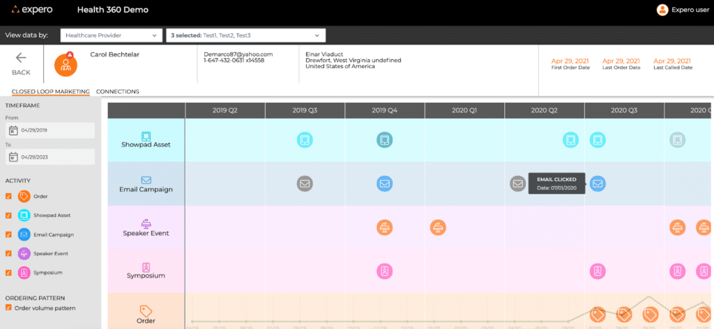
At the bottom of the swim lane, we are looking at orders, and then we have different swim lanes, depending on our customer touchpoints and marketing events like a speaker event, email campaigns, and shop assets. So the traditional data analytics make it a highly complex view because you have one or more orders on any particular day
Bringing everything together, in one particular view to see what actually made a difference, means a lot. Looking at this particular view could show what we did in certain quarters, like sending some of the marketing assets, having the email campaign, and getting invited to a symposium, which could have potentially triggered an upward trend pattern in ordering for the customers. This is where putting everything together gives perspective, and we can see what really worked or what triggered it to help us take it to the next level of further analysis.
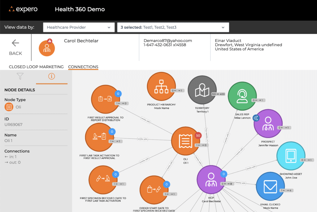
This is the power of graph: you get to see all the connections together on the interactive web interfaces, or in TigerGraph Studio, as well. We’re looking at what is happening around our customers; it could be the number of orders or related to the organization’s parent company. Then, we can drill down into specific details about what is happening around each of the orders we have received from the physician and then get down to the details of the predictive analytics and what exactly worked.
This analysis puts into perspective and summarizes the power of the graph, but in a well-designed, interactive web interface so that not everybody has to start learning how to write queries and TigerGraph.
You can listen to the full presentation here.