Products
TigerGraph Savanna
TIGERGRAPH DB
Community Edition
AI & Graph Intelligence
Agentic AI
GraphRAG
Hybrid Graph + Vector Search
Graph Data Science Library
Languages and Tools
Solution Kits
GSQL Query Language
openCypher Query Language
GraphStudio
Insights
Connectors
Compare Editions
Solutions
Solutions
Solutions Overview
Increase revenue
Product Marketing
Customer 360
Entity Resolution
Recommendation Engine
Manage risk
Fraud Detection and Protection
Cybersecurity Threat Detection
Anti-Money Laundering (AML)
Risk Assessment and Monitoring
Improve operations
Supply Chain Analysis
Network Optimization
Energy Management System
By industry
Advertising, Media, Entertainment
Financial Services
Healthcare & Life Sciences
Foundational
AI & Machine Learning
Time Series Analysis
Geospatial Analysis
Developers
Download
TigerGraph DB
TigerGraph Docker Image
GSQL Client
Developers
Documentation
Developer Hub
Ecosystem
Community Forum
Resources
Blog
TigerGraph Blog
Resources
Demos
Webinars & Events
Videos & Podcasts
Benchmarks
Reports & Whitepapers
Datasheets
Glossary
Pricing
Services
Services and Support
TigerGraph University
Training & Certifications
TigerGraph Support
Documentation
Production Guidelines
Company
Company
Company Overview
Leadership
Legal Terms
Patents
Security and Compliance
Careers
Join Us
Open Positions
Customers
Ford
Intuit
Jaguar Land Rover
Xbox
Read more success stories
Press Room
News and Press Releases
Awards
Partners
Partner Benefits
TigerGraph Partners
Contact Us
Products
TigerGraph Savanna
TIGERGRAPH DB
Community Edition
AI & Graph Intelligence
Agentic AI
GraphRAG
Hybrid Graph + Vector Search
Graph Data Science Library
Languages and Tools
Solution Kits
GSQL Query Language
openCypher Query Language
GraphStudio
Insights
Connectors
Compare Editions
Solutions
Solutions
Solutions Overview
Increase revenue
Product Marketing
Customer 360
Entity Resolution
Recommendation Engine
Manage risk
Fraud Detection and Protection
Cybersecurity Threat Detection
Anti-Money Laundering (AML)
Risk Assessment and Monitoring
Improve operations
Supply Chain Analysis
Network Optimization
Energy Management System
By industry
Advertising, Media, Entertainment
Financial Services
Healthcare & Life Sciences
Foundational
AI & Machine Learning
Time Series Analysis
Geospatial Analysis
Developers
Download
TigerGraph DB
TigerGraph Docker Image
GSQL Client
Developers
Documentation
Developer Hub
Ecosystem
Community Forum
Resources
Blog
TigerGraph Blog
Resources
Demos
Webinars & Events
Videos & Podcasts
Benchmarks
Reports & Whitepapers
Datasheets
Glossary
Pricing
Services
Services and Support
TigerGraph University
Training & Certifications
TigerGraph Support
Documentation
Production Guidelines
Company
Company
Company Overview
Leadership
Legal Terms
Patents
Security and Compliance
Careers
Join Us
Open Positions
Customers
Ford
Intuit
Jaguar Land Rover
Xbox
Read more success stories
Press Room
News and Press Releases
Awards
Partners
Partner Benefits
TigerGraph Partners
Contact Us
Risk and Fraud Analytics
Discover our blog
Categories
All Categories
About TigerGraph
Agentic RAG
Benchmark
Business
Community
Compliance
Customer 360
Cybersecurity
Data Science
Developers
Digital Twin
eCommerce
Engineers
Entity Resolution
Finance
Fraud / Anti-Money Laundering
GQL
Graph + AI
Graph Algorithms
Graph Analytics
Graph Databases
Graph Databases Comparison
Graph Neural Networks
GraphRAG
GSQL
Healthcare
KYC risk assessment
Machine Learning / AI
Risk and Fraud Analytics
Supply Chain
TigerGraph
TigerGraph Cloud
Results
Entity Resolution, Risk and Fraud Analytics
Fri 17 Jul 2026
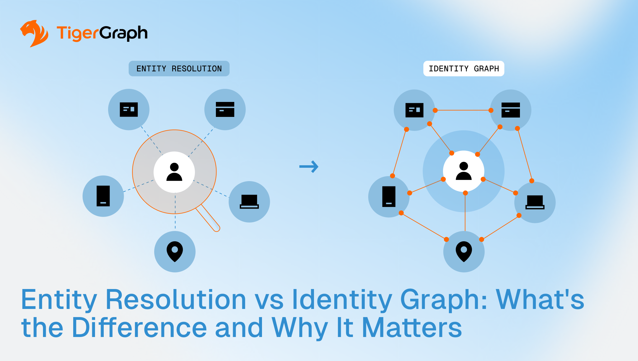
Entity Resolution vs Identity Graph: What’s the Difference and Why It Matters
Discover
Risk and Fraud Analytics
Mon 29 Jun 2026
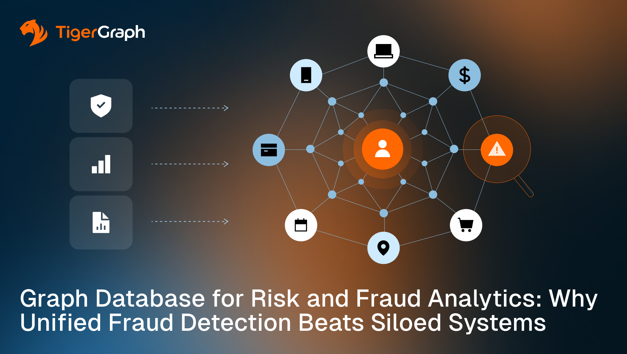
Graph Database for Risk and Fraud Analytics: Why Unified Fraud Detection Beats Siloed Systems
Discover
Fraud / Anti-Money Laundering, Risk and Fraud Analytics
Tue 21 Apr 2026
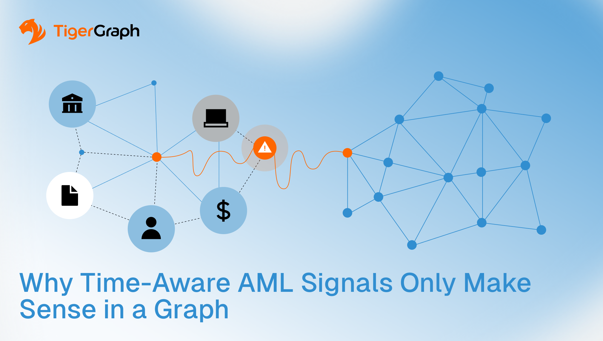
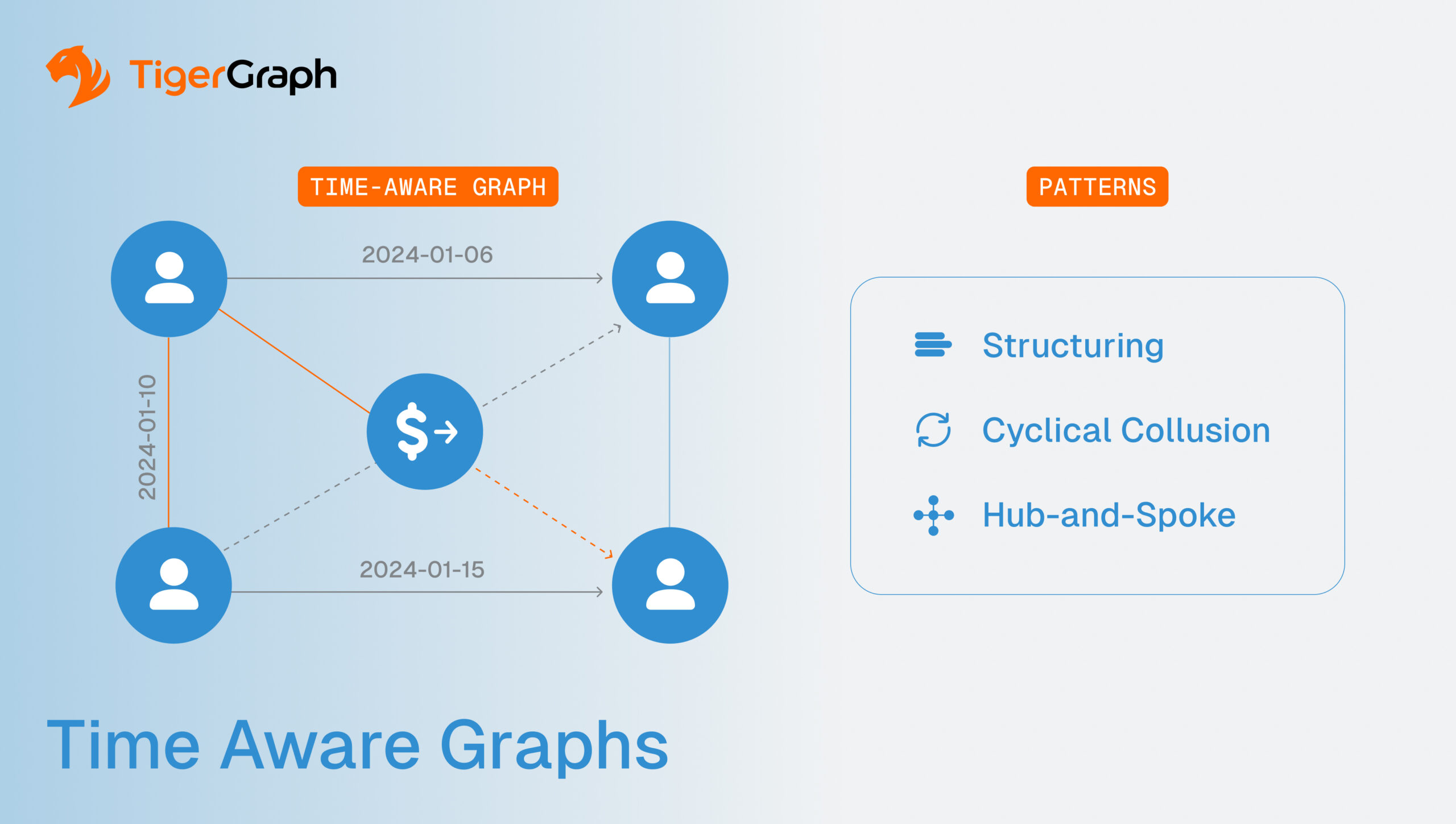
Why Time-Aware AML Signals Only Make Sense in a Graph
Discover
Graph Algorithms, Graph Databases, Risk and Fraud Analytics
Fri 10 Apr 2026
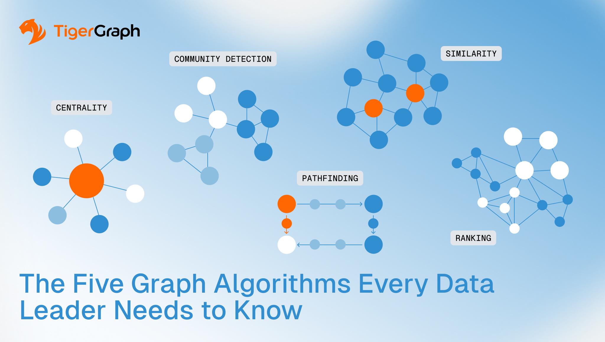
The Five Graph Algorithms Every Data Leader Needs to Know
Discover
Graph Databases, Risk and Fraud Analytics
Wed 8 Apr 2026
Why Connections Matter More Than Ever in Data Analytics
Discover
Data Science, Graph Databases, Risk and Fraud Analytics
Wed 8 Apr 2026
What Airline Routes Teach Us About Graph Analytics at Scale
Discover
Graph Databases, Risk and Fraud Analytics
Thu 5 Mar 2026
What You’re Missing with Traditional BI vs Graph Analytics
Discover
Entity Resolution, KYC risk assessment, Risk and Fraud Analytics
Thu 19 Feb 2026
Proximity Risk in KYC and KYB: Why Second-Degree Connections Change the Outcome
Discover
Finance, Fraud / Anti-Money Laundering, Risk and Fraud Analytics
Tue 4 Nov 2025
Connected Risk in Banking: How Graph Databases Build Resilience for Banks
Discover
Fraud / Anti-Money Laundering, Graph Databases, Risk and Fraud Analytics
Mon 15 Sep 2025
Time-Aware Graphs: Solving Temporal Risk in AML
Discover
Graph Databases, Risk and Fraud Analytics, Supply Chain
Thu 15 May 2025
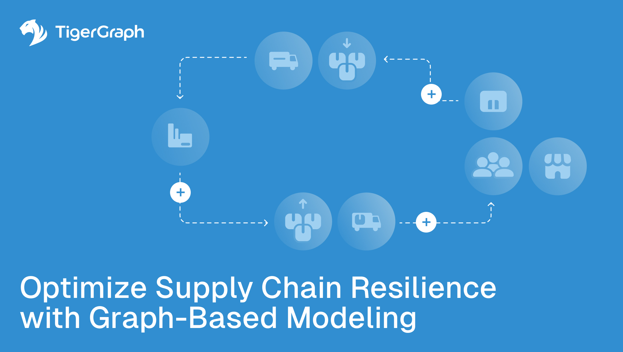
Optimize Supply Chain Resilience with Graph-Based Modeling
Discover
Fraud / Anti-Money Laundering, Graph Databases, Risk and Fraud Analytics
Fri 25 Apr 2025
Why Fraud & Risk Teams Are Adopting Graph Analytics
Discover