From Data Chaos to Clarity: Why Graph Visualization Powers Smarter Decisions
Every enterprise has an overabundance of data to contend with, and making sense of it all is challenging. Dashboards multiply, reports pile up, and somewhere in the noise, the real story gets lost. Leaders don’t struggle with access to information; they struggle with clarity.
That’s where graph visualization comes in. Instead of serving up more disconnected charts or static tables, it shows you the relationships that actually drive outcomes. Who’s connected to whom, which systems rely on each other, and where risk is hiding in plain sight.
For executives, this shift is transformative. With the right graph visualization tools, you see beyond numbers to the underlying context. And context is what turns data chaos into decisions you can act on.
What Is Graph Visualization?
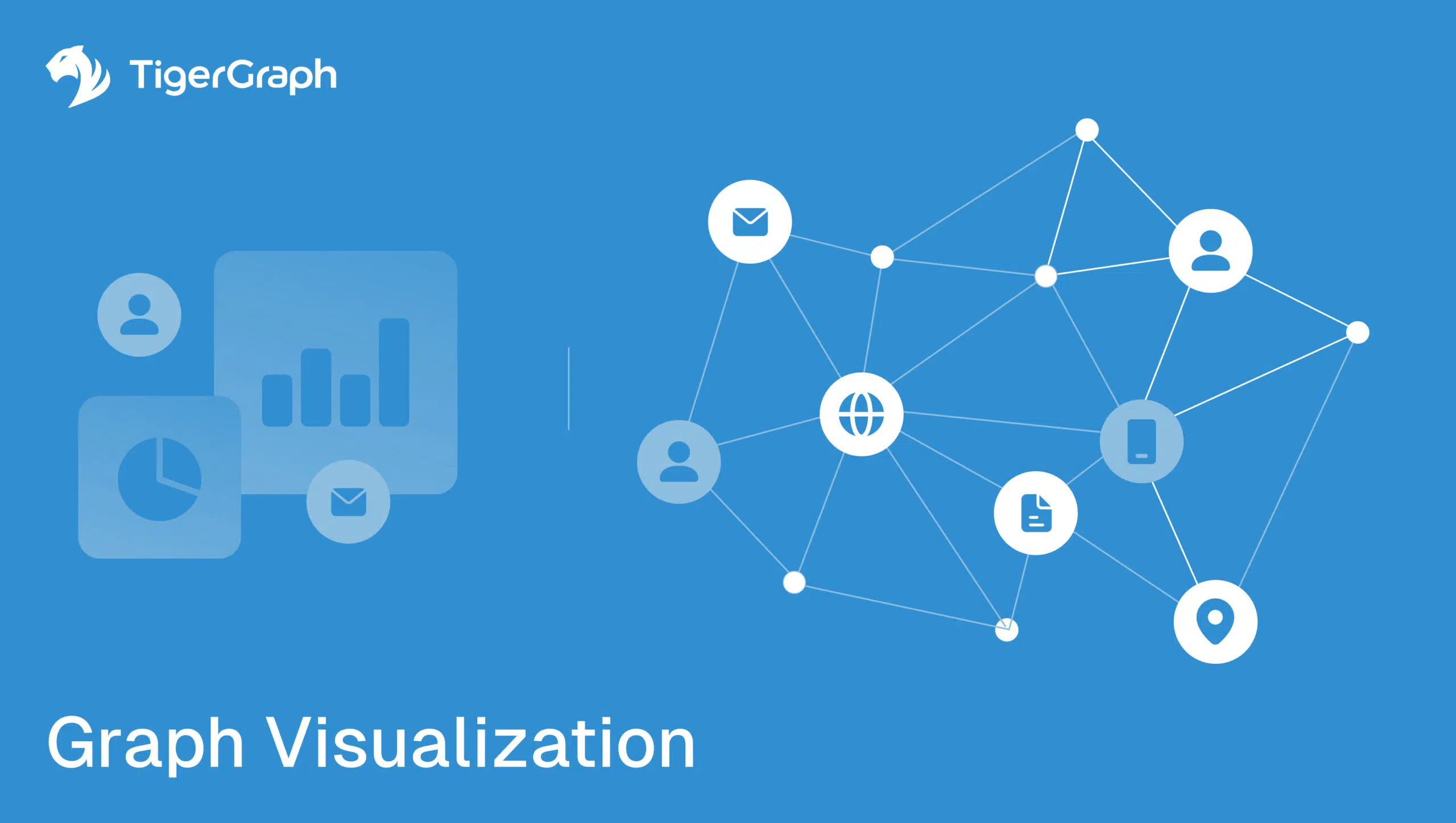
At its core, graph visualization is about seeing connections. Instead of staring at endless rows in a spreadsheet or bar charts in a database visualization dashboard, you’re looking at a living network of nodes (your entities) and edges (the relationships between them). It’s less about isolated data points and more about how those points interact.
Think of it this way: spreadsheets can tell you what happened, but they rarely show you why. A good graph visualizer flips that around.
Suddenly, you can trace how fraud rings evolve across dozens of accounts, how suppliers are tied together across continents, or how a patient’s journey weaves through different treatments and providers. Executives exploring connected data often rely on a graph viewer to navigate nodes and edges intuitively, complementing the power of advanced graph visualization tools.
Traditional visualization tools summarize. They give you the totals, the averages, the one-dimensional views. But graph visualization software adds depth. It uncovers the story hidden between the lines—why certain customers churn, why a supply chain bottleneck keeps repeating, or why an insider threat quietly emerges even when all the KPIs look fine.
This is what makes graph visualization so powerful: it doesn’t just show you data, it shows you context. And in executive decision-making, context is everything.
Why Graph Visualization Matters for Enterprises
Executives need clarity, not more charts. Most dashboards demonstrate disconnected KPIs, forcing executives to hunt for patterns that never quite emerge.
Graph visualization changes this by focusing on the relationships behind the metrics. It gives leaders the ability to see how data points influence each other, which is where real business insight lives.
Consider how much of enterprise value is locked up in connections: customers linked to multiple accounts, suppliers tied to shared logistics hubs, or employees connected through informal networks that affect productivity. These aren’t “nice to know” details—they’re the levers that drive growth, compliance, and resilience. A strong graph database visualization tool puts those levers in plain sight.
The benefits ripple across the organization:
• Reveals hidden patterns: Complex risks, like collusion in fraud networks or insider trading rings, often hide behind ordinary transactions. These tools expose these by highlighting unusual clusters or connections.
• Accelerates clarity: Interactive graph visualization helps executives can move beyond static charts to dynamic exploration. They can ask “what if?” in real time and see the answers instantly.
• Breaks down silos: Finance, compliance, and operations can all view the same relationship graph, rather than relying on fragmented reports that do not align.
• Scales with the enterprise: Whether you’re looking at millions or billions of relationships, large graph visualization platforms ensure decision-makers don’t lose sight of the bigger picture.
It is a definite advantage in an environment where speed and context determine who wins.
Key Use Cases for Graph Visualization
The most valuable insights hide in connections between entities. Graph visualization tools make those connections impossible to miss. Here’s how enterprises are already putting them to work:
- Fraud Detection
Fraud doesn’t happen in isolation. It hides in webs of mule accounts, on shared devices, and in suspicious transactions that are spread across institutions. A traditional visualization might catch some of these as a single outlier transaction, but miss the larger web. With graph database visualization tools, investigators can see the bigger picture:
- Spot hidden collusion. It highlights unusual clusters of accounts that share IP addresses, devices, or transaction patterns, surfacing fraud rings that evade rule-based detection.
• Trace relationships in real time. With interactive graph visualization, fraud analysts can follow the money across accounts, payment processors, and geographies, as transactions occur.
• Improve accuracy and reduce false positives. By focusing on relationships rather than isolated events, graph visualization software helps banks catch true fraud faster while avoiding wasted investigations on harmless anomalies.
This results in stronger compliance, less loss, and the ability to stay a step ahead of increasingly sophisticated fraudsters.
- Cybersecurity
Cyberattacks succeed by exploiting complexity. Hackers don’t walk in through the front door—they move laterally, hopping between accounts, devices, and cloud services in ways that overwhelm traditional monitoring systems. Graph visualization helps security teams keep pace by mapping the relationships attackers rely on.
- Reveal attack paths. It can show how a compromised user account is connected to servers, databases, and sensitive assets before an attacker exploits that path.
• Correlate events across systems. With an open source graph visualization tool integrated into SIEM platforms, logs from firewalls, endpoint detection, and identity systems can be stitched into a single connected picture.
• Accelerate incident response. Instead of piecing together flat logs, analysts explore an interactive graph visualization of devices, users, and alerts, reducing the time it takes to spot and contain threats.
For executives, this means fewer blind spots, faster recovery, and a security posture built for today’s hyperconnected risk landscape.
- Customer 360 and Experience
Executives know “customer centricity” is a competitive mandate. Yet customer data is scattered across CRMs, marketing platforms, support systems, and payment processors. A knowledge graph visualization tool stitches these silos together, creating a complete customer view. With this connected perspective, leaders can:
- Pinpoint potential churn before it happens. Instead of waiting until there’s a purchasing lull, graph visualization highlights early warning signs, like declining engagement, delayed payments, or sudden service complaints, so retention teams can intervene in time.
• Identify cross-sell opportunities by linking purchasing behaviors. When you see which products or services tend to cluster together in the same customer journeys, you can proactively recommend the next logical step, boosting revenue without guesswork.
• Personalize outreach at scale. A connected view makes it possible to move beyond generic marketing. By visualizing customer histories and relationships, enterprises can tailor campaigns that resonate with specific segments, or even with individual customers, at the right time and through the right channel.
Instead of guessing what a customer might do next, enterprises can see the journey unfolding, because it’s mapped out in the graph.
- Healthcare and Life Sciences
Effective healthcare hinges on understanding patient relationships. But patients move across hospitals, specialists, labs, and pharmacies, leaving fragments of data with each. And these bits and pieces rarely match up.
Traditional visualization tools struggle to connect these dots. This leaves clinicians and administrators with blind spots that affect both care and compliance. Graph database tools close this gap by weaving those fragments into a unified picture.
- Link patient journeys. A graph db visualization makes it possible to follow a patient from initial diagnosis to treatment and outcomes, even when the records live in different systems. This continuity supports more informed clinical decisions and reduces duplication of tests or procedures.
• Accelerate research. With a knowledge graph visualization tool, researchers can connect genes, biomarkers, treatments, and outcomes across vast datasets. This speeds up the discovery of new therapies and helps identify which patients are most likely to benefit.
• Improve regulatory compliance. Healthcare organizations face strict requirements for data integrity and reporting. This software provides traceability, showing not just data points, but how they’re related, and making audits and compliance reviews far more transparent.
The payoff is significant: better patient care, faster research breakthroughs, and reduced compliance risk—all powered by the ability to visualize connections that matter.
- Supply Chain and Operations
Supply chains are famously interconnected, and they’re also famously fragile. A single missed shipment can cascade into multimillion-dollar losses, creating ripple effects across production, sales, and customer satisfaction.
Enterprises can map suppliers, logistics hubs, and distributors as one connected system by deploying this software. This allows leaders to:
- Anticipate bottlenecks. Instead of learning about delays after they’ve already slowed production, it highlights which suppliers or routes are under the most strain. Leaders can reallocate orders or adjust schedules before problems escalate.
• Identify single points of failure. Many global enterprises unknowingly rely on a small number of vendors, ports, or facilities. A large graph visualization instantly surfaces these dependencies, giving executives a chance to diversify sourcing and reduce risk exposure.
• Test “what if” disruptions before they happen. With interactive graph visualization, enterprises can simulate scenarios like “What if this shipping lane closes?” or “What if this factory goes offline?” The ability to explore these hypotheticals live equips leaders with contingency plans before disaster strikes.
The result is a supply chain that’s not only visible, but resilient, and able to withstand shocks and keep business moving even when the unexpected occurs.
TigerGraph’s Advantage in Graph Visualization
For enterprises, it’s not enough to see connections. You need to explore them at scale, in real time, and with confidence that your insights are accurate. And this is where TigerGraph stands apart.
- Performance at scale. While many tools struggle once networks reach millions of entities, TigerGraph delivers this visualization across billions of nodes and edges with sub-millisecond query speed. This means executives aren’t waiting on overnight reports; they can ask “what if?” in the boardroom and get answers on the spot.
• Built for business-critical workloads. TigerGraph isn’t just layered on top of legacy systems. It’s a purpose-built graph database tool designed for high-concurrency workloads in banking, healthcare, manufacturing, and beyond. That translates into reliability and trust, no matter how complex the questions get.
• Actionable, not just pretty pictures. Many tools produce attractive charts but stop short of delivering a strategy. TigerGraph combines software with advanced graph analytics, enabling leaders to explore data visually and also measure influence, detect anomalies, and model scenarios directly within the same platform.
• Future-ready integration. Whether embedding interactive graph visualization into fraud detection systems, connecting with AI workflows through knowledge graphs, or empowering teams with open APIs, TigerGraph adapts to enterprise needs rather than locking teams into rigid frameworks.
For executives, this means visualization acts as a decision-making engine, instead of just another reporting layer. TigerGraph gives leaders the clarity to move quickly, the confidence to act on connected intelligence, and the scalability to future-proof their business.
Conclusion
Context is the true differentiator in our age of data abundance. Connected intelligence empowers executives to act with clarity. And advanced visualization tools help enterprises move from static reporting to dynamic discovery, unlocking a competitive edge where others see only noise.
Enterprises that invest in graph visualization software for business gain both speed and context when making critical decisions.
Leaders are under pressure to deliver growth and resilience. The ability to see relationships at scale is a definite advantage.
Enterprises that move beyond static dashboards to embrace connected intelligence will be the ones to adapt fastest, out-innovate competitors, and meet rising stakeholder expectations. In today’s connected economy, context = survival.