

Originally posted on Towards Data Science by Akash Kaul.
Introduction
Graph databases have been revolutionizing the world as we know it. In the past decade, they have proven their usefulness in tons of cases, from social media networks to fraud detection to recommendation engines. The true strength of graph databases is the ability to efficiently represent the relationships between pieces of information. This especially applies to data that is highly connected, like hospital records.
In this blog, I’ll be walking through an example of how we take healthcare data stored in a graph database and visually show a sample of that information in 3D. Because of the large number of connections, 2D network graphs can quickly become cluttered and unreadable; however, these issues can be handled by changing our perspective. In cases where the 2D option fails, 3D graphs provide an expansive view of the data that is much easier on the eyes.
Since the data is stored in a graph database, it only makes sense to visualize it with a graph. That way, all we have to do is translate the connections that already exist in the database into something visible.
With that background, let’s start making our 3D graph masterpiece!
The full code for this blog can be found on my Github.
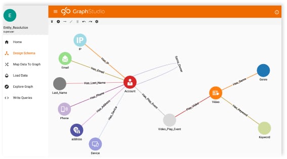
Designing a Graph Database Schema
The graph database I used for this project was built on TigerGraph using synthetic patient data generated by a neat, open-source program called Synthea. If you are unfamiliar with Synthea, check out this short blog I wrote or have a look at their website.
If you’re interested in seeing the process I used to design this healthcare network, check out my last blog post.
Otherwise, feel free to design your own graph or use a premade one. TigerGraph has tons of tutorials and examples that can help you design your own graph. Optionally, you can reference an article I wrote that takes you through the general graph design process.
Everything I mention from this point on can be done with any graph.
Accessing The Graph
To access our graph, we’ll use the pyTigerGraph Python connector created by Parker Erickson. After installing and importing the package, you can connect to your graph server using the following code:
If you don’t have a token, you can create one with a secret.
Next, run an installed query to grab data from the graph.
Here’s the query. It grabs all patients as well as all edges and vertices immediately connected to those patients.
Formatting the Data
When we run our query, it returns a lot of information. We could try to graph all of the data coming in (essentially graphing the majority of the healthcare touchpoints for these patients), but our graph would end up looking very messy. So, we’ll just grab a subsection of our data.
I chose to select the patients, their addresses, and any allergies or imaging studies they’ve had in their lifetime.
This code may be confusing, so let’s dissect what’s going on.
- First, extract the 3 lists that correspond to the 3 print statements in our GSQL query.
- Next, create two lists called nodes and links. These will contain the vertices and edges for our 3D graph.
- Now, grab all of the nodes that represent patients, addresses, allergies, or imaging studies. For each node, we add three attributes: id, description, and group. The id is the identifier used by the graph to make connections. The description is the text that appears when you hover over a node, and the group is used for coloring the nodes.
- For each link, we also have three attributes: source, target, and group. The group attribute again corresponds to coloring. The source and targetattributes correspond to the id of the source and target vertex for that edge.
- Finally, add the two lists to a dictionary in JSON format. This step is key since data in other formats will not be recognized by our JavaScript function.
With that, the data is now good to go!
Passing the Data with Flask
In order for our JavaScript functions to receive the graph data from Python in real-time, we need to set up a server. We’ll do this using Flask. All we have to do is wrap the functions we’ve already created in the Flask web server structure. The full Python code should now look something like this:
The python part of this project is now complete!
Creating the Graph
The heart of this visualization is the 3D-Force-Graph package. Built on top of ThreeJS and WebGL, this package makes generating force-directed graphs very simple.
Like most web apps, this network graph visualization was built using HTML, JavaScript, and CSS. Let’s take a look at each of those components individually.
HTML
The HTML for this project is pretty straightforward.
Key components:
- 3d-force-graph package
- CSS stylesheet
- JavaScript code (data-set-loader.js)
CSS
Nothing special here.
JAVASCRIPT
Let’s again break down this code into smaller steps.
- Use the fetch statement to grab the data from our Flask server
- Generate our graph using the 3D-Force-Graph package
- Specify graph properties (i.e. color by group, set hover data to “description”)
- Create a loop to make the graph spin. Why? Because spinning graphs are awesome!
CORS Issue
Most likely, you will run into a CORS error if you try and run this code as-is.
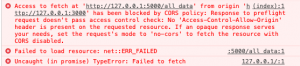
You can read about CORS issues here. To solve this, you need to specify response headers that will allow the data to flow. I fixed this using the Moesif Origin and CORS Changer extension for Google Chrome. This works great if you are running the program locally. However, if you want to deploy the graph, you will need to configure the appropriate settings on both Flaskand JavaScript.
The Fun Stuff
That’s all of the code. Now, all we have left to do is run the server and admire the graph in all of its glory.
Conclusion
With not a lot of code, we gathered a lot of data stored in a graph database and created an awesome 3D visualization to show that data. We used TigerGraph to store the healthcare information, Python to extract and process our data, and JavaScript and HTML to create the 3D visual. The process isn’t very complex but leads to super cool results. The methods shown in this blog can be used beyond the healthcare industry, too. Any field dealing with highly connected data can benefit from graphs, using the power of graph databases for storing information and the power of 3D network graphs for displaying information.
I hope you enjoyed reading this blog and learned something new! Let me know what you think and connect with me on LinkedIn.